As I’m sure some of you may have noticed, Texas Electricity Ratings has recently undergone a very noticeable face-lift. The redesign has been a long time coming and required a lot of great work from many people, and I’m very excited about everything. There’s lots of great new things I can do behind the scenes from a technology standpoint to continue to improve this site, and with fast turnaround times. However, I want to take the time in this post to highlight some of the changes that benefit you: the shoppers.
Shopping:
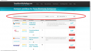
First, I want to highlight the most important function of this website, the shopping experience. After a customer enters their zip code, they’ll be offered a sampling of the electricity plans available from the electricity providers in their area. Now, however, the new Filter and Sort system at the top makes it even easier to find the plans that fit your needs as a customer. With the filter drop down, shoppers can sort the electric plans by their Texas Electricity Ratings Score, Alphabetically by REP (Retail Electricity Provider Name), the Lowest Priced Plans and the length of a plan’s contract Term. Additionally, Shoppers can also use the Filter down downs (also works concurrently with the Sort drop down) to show only Month-to-Month plans, Fixed-Rate plans, Green Energy plans, or Pre-Paid electricity plans. This should make things much easier for shoppers to find exactly what they want:
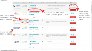
Additionally, the display of the plans themselves has changed. Now customers can see the company name and logo, the name of the plan, the plan’s contract term, and some of the special offers or outstanding details about the electricity provider in an easy to read format. When a customer holds their mouse over the lightbulbs, they’ll see that company’s specific numerical ranking according to Texas Electricity Ratings. Of course at the far right is the kilowatt-per-hour (kWh) rate of the plan in light blue. One new neat change is that for month-to-month plans, which are often advertised at a Promotional Rate, I now show that rate as well as the “Roll-Off Rate,” which is the expected kWh rate a customer will pay after their promotional term expires.
Probably the most common complaint I get from customers is the confusion of their rate increasing substantially after their promotional period expires. This should specifically combat that and give customers the information they need to make the best decisions for themselves. I’m particularly happy about that feature.
Also, beneath each plan there are some images and links to help give customers more information about that specific plan, such as if it is a Fixed Term, an Indexed Plan, a Variable Plan, or a Pre-Paid plan. By hovering over each image with your mouse, information about that plan will appear. When I have received them from the electricity providers, there will also be links to that plan’s Electricity Facts Label (EFL), which is basically that plan’s fine print and something every shopper should read before they sign up with an electricity provider.
I’ve highlighted these things below:
 Improved Navigation:
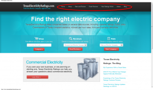
Next, I want to highlight the improved navigation on the home page, which now exists throughout the entire website, which was something that was lacking before. Through this more robust header, shoppers are a click or two away from getting to any page they want on the whole website:
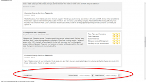
Additionally from a navigation standpoint, the site now also has a Quick Navigation bar. Did you finish reading some reviews for Champion Energy and want to read reviews from another provider? Or shop for another provider’s plans? Now the quick links bar lets you jump to any other providers review or plan page on the whole website with easy drop down menus:
Blog:
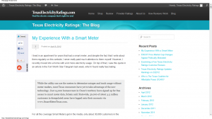
Another big component of Texas Electricity Ratings has always been my blog posts. But before, it was on a separate, not ideally connected blog hosting site at WordPress. Now the Texas Electricity Ratings blog is housed with the rest of the website, and it has a nice new look and feel. It also has convenient links and tie-ins for Facebook, Twitter, Google Plus and Pinterest for people to share with their friends and followers if they happened to find something I wrote helpful or insightful. This should help the entire Texas Electricity Rating network, the website, the facebook page and the twitter account tie together and create a much more effective community for our shoppers to leverage. I’m pretty excited about this as well.
Anyway, those are just a few of the changes to the Texas Electricity Ratings website, which I’m calling TER 2.0. I just wanted to share them with everyone and say that lots of cool, new things are still on the way with the website, which should in turn help customers leverage the Texas electricity market to their advantage.
